Making a cover for your book is one of the hardest things to do. A cover is like clothing. How many times have you said before some important event, “What am I going to wear?” You know you want to make a great impression, but you don’t know what will do the trick.
Covers, too, need to make a lasting impression. They need to do the trick. But how? My goddaughter Emma Rose, who’s in elementary school, had some pretty right-on criticisms of the proposed cover for her mother’s new book. Here’s what she said:
- Okay. That part's too dark.
- That photo is over-processed.
- Why is that font so fussy?
- Why didn't they use the whole space on this part—what's all the white space about?
- And this section over here? Bor-ing.
- This background needs to be lightened up, because you can't read the type over it.
- Too many different fonts.
- This one looks like they typed it in an office.
- This one is very good.
- No no no no no.
- This one will be good if they move the title up more so it's not covering the town part of the photo; it should be covering the sky….
Okay, let’s consider what she said.
Dark covers don’t appeal to people, especially to children, who, it seems—and I got this from a librarian friend—always head for the light, bright book.
Book covers need to be clear in their message. The images shouldn’t be overworked, and the typeface shouldn’t be too fussy nor should there be too many different faces [fonts]. One face or two is all you need.
The cover, of course, can’t be borrrrrring. But what does that mean? It probably means that there is something mysterious on the cover. It might mean that there is a comical illustration. It might just be that there is a nice, friendly person or animal on the cover. Scary is good, but not for all ages.
Don’t let the type cover up the image. After all, it is the image that will sell the book. In fact, it seems that one overriding factor for a children’s picture book is that the image and the message it conveys be seen from across the room. Like a magnet, the image has to draw the kid in and get the little reader to open the book.
Consider the overall design. By this, consider the negative space, the “white space,” as Emma Rose puts it. Make sure that there is a balance between what is there and what is just plain background.
To Emma Rose’s comments, I might add a few questions you might ask yourself about the cover you’ve just come up with:
- What part of the book does the cover show?
- Does the cover tell you what kind of book it is?
- Does the cover show the best part of the book?
- Does the cover promise more than the book actually gives?
- What is the order: author then title or title then author?
- What stands out the most, the title, the author, or the image?
It is, let’s face it, easier to criticize whether constructively or destructively a cover. What is difficult is to come up with a cover out of thin air. Creation is…well…like the Big Bang. It starts with nothing, gets super heated, and expands at an alarming rate. Before you know it, you have too many ideas and you are faced with too many choices.
What to do? I suppose that the best advice is to keep it simple. Instead of trying to cover all of your bases and tell everything about your book with your cover, just settle on one idea. If your idea is appealing, the reader will open the book, guaranteed.
I can’t say that all of my covers have been successful. In fact, I’d say that some of them are fairly dismal. Had Emma Rose been standing by my side, she might have pointed out some fairly obvious booboos. But, I hope that with the above, you might form a checklist of do’s and don’ts.
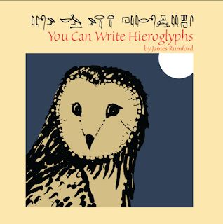
Here’s the first attempt of a cover for my next book You Can Write Hieroglyphs.
When I got the proof back from CreateSpace, I realized I still hadn't followed the "no-dark" rule. So I lightened the owl. For now, unless I think of something better, I am sticking with this cover.
I’ve published You Can Write Hieroglyphs through my Mānoa Press. (You can get a copy here: http://www.amazon.com/You-Write-Hieroglyphs-James-Rumford/dp/1891839268/ref=sr_1_1?ie=UTF8&qid=1464723575&sr=8-1&keywords=You+can+write+hieroglyphs ) I want the book to be a follow up of my Seeker of Knowledge, about François Champollion’s decipherment of ancient Egyptian, which I published through Houghton Mifflin over fifteen years ago.
You Can Write Hieroglyphs was inspired by Kurt Wiese’s 1946 Caldecott Honor book, You Can Write Chinese, a book which I loved as a second grader.
I remember refusing to go to bed until I had copied all of the Chinese characters in the book. Here is one of the pages I copied that night:
Although Wiese’s book is terribly out-dated, it did something magical: it inspired me to spend a lifetime learning Chinese. We authors should all be so lucky to have written a book with that kind of power.
And one more thought: did Wiese’s cover draw me in? I don’t know now. Something, though, got me to check the book out and take it home from my school library.
As for my You Can Write Hieroglyphs, here below are a few sample pages. I'm just betting there will be some kid out there that, like long-ago me, who will delight in the beauty of these hieroglyphs, copied after a scribe who lived centuries and centuries ago.


No comments:
Post a Comment